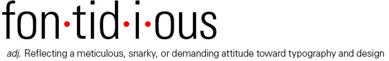
adjective
1. very critical about typography; hard to please
2. reflecting a meticulous, snarky, or demanding attitude toward typography and design
3. easily disgusted by Comic Sans
Germanic, from font + fastidious, as defined by Schantz. First known use: last Saturday, at breakfast.
I’m a snob about typography, and I’m not afraid to say so. Which can be pretty annoying when you’re sitting across from me at breakfast wearing a t-shirt you designed. It’s a funny t-shirt, too, but you used italics. “Italics are only for book titles, and emphasis, and foreign words!” I start yelling at you, waving my peanut butter toast. “It is important not to overdo the use of italics to emphasize words. After a while, it loses its effect and the language starts to sound like something out of a comic book.” You’ve begun to back your chair away.
And karma comes nipping at my ass two days later when the New York Times unveils its new web design and the left column has all the headlines in italics.
I must pluck my eyes from my head.