Monthly Archives: April 2014

a many of

Myriad.

Such a pretty word. Sadly, misused myriad times.

Many, people. It means MANY.
[Technically, it means ten thousand, but let’s not go there.]

Would you say, “I have worn my underpants inside out a many of times”?
Of course not! You would not admit to something like that, would you?

lying

In one of my other lives I’m a yoga teacher. But because I’m also a fontidious perfectionist, I was horrified to learn that I’ve been misusing lie and lay in my classes.

I had been saying, “Let’s lay down on the floor.” The schoolteachers in my class were undoubtedly thinking, “What is it that she wants us to lay on the floor? Each other?”

So unless you want to create a spectacle of yourself, you lie down on the floor.

Public humiliation. Nothing like it to help one remember the correct usage.

Here’s the short version of how to remember this: you lie down. You also may lie, but that’s your problem. If you’re placing an object, you lay it down.

Grammar Girl and other websites go into detail about present tense, past tense, and past participles. You should go read them. Do that before you lie down.

measure

Measure = the number of characters (letters and spaces) in a line of type.

If you’re hoping that a live person might actually read your writing, make it easy on them. A measure of more than 78 characters and your reader is likely to go watch an episode of “The Real Housewives of New Jersey” between lines.

Here are the commandments from the bible of typography, The Elements of Typographic Style:
•    45 to 75 characters is a good length for a single-column page
•    66 characters is ideal
•    For multiple columns 40 to 50 characters is better

This is, of course, dependent on your type size. Average size for a printed publication is 10 to 12 points.You would not want to write lines of text 60 characters long in 36-point type. The publication would be the size of your car.


straight or curly?

Hair? Er, no. Today let’s talk about quotation marks.

Curly quotes (AKA typographer’s quotes or smart quotes) are used in good typography. Straight quotes (dumb quotes) make you look unprofessional, reckless, and just plain dumb.

straight small 3

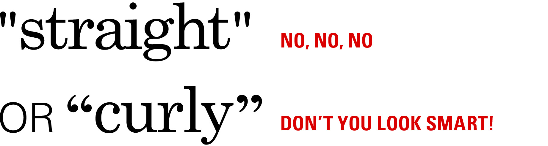
In traditional typography, all quotation marks were curly. But when the damn typewriter came along, the curly quotes were replaced by straight quotes to save a slot for another character. Undoubtedly something stupid, like Q.

Computers are not constrained by space issues, so you can always find curly quotes. In some programs, such as inDesign, you can set your preference to typographer’s quotes. How do you do this in other programs? What, do you think I’m a typography expert? Google it.

Why does it matter? Curly quotes are more legible, and, like gravity, they’re not just a good idea. They’re the law.