Brilliant design by Tom Gabor, http://tomgabor.com/i-shot-the-serif/
Don’t forget, designers use bullets.
Brilliant design by Tom Gabor, http://tomgabor.com/i-shot-the-serif/
Don’t forget, designers use bullets.
I often wonder who patient zero was.
I imagine that some lowly shopkeeper went out to paint “Bananas $3” on his sign, and was stricken with an uncontrollable urge to add an apostrophe. And soon his banana was the proud owner of $3. Not to be outdone, his rival down the street advertised “Banana’s 2 Dollar’s.” Then someone from the town full of affluent bananas went on a trip, carrying the contagion with him. “Train’s Departing Every 5 Minute’s.”
The pandemic had begun.
There’s a depressing topic for mid-February. But let’s leave thoughts of liposuction aside and concentrate on type.
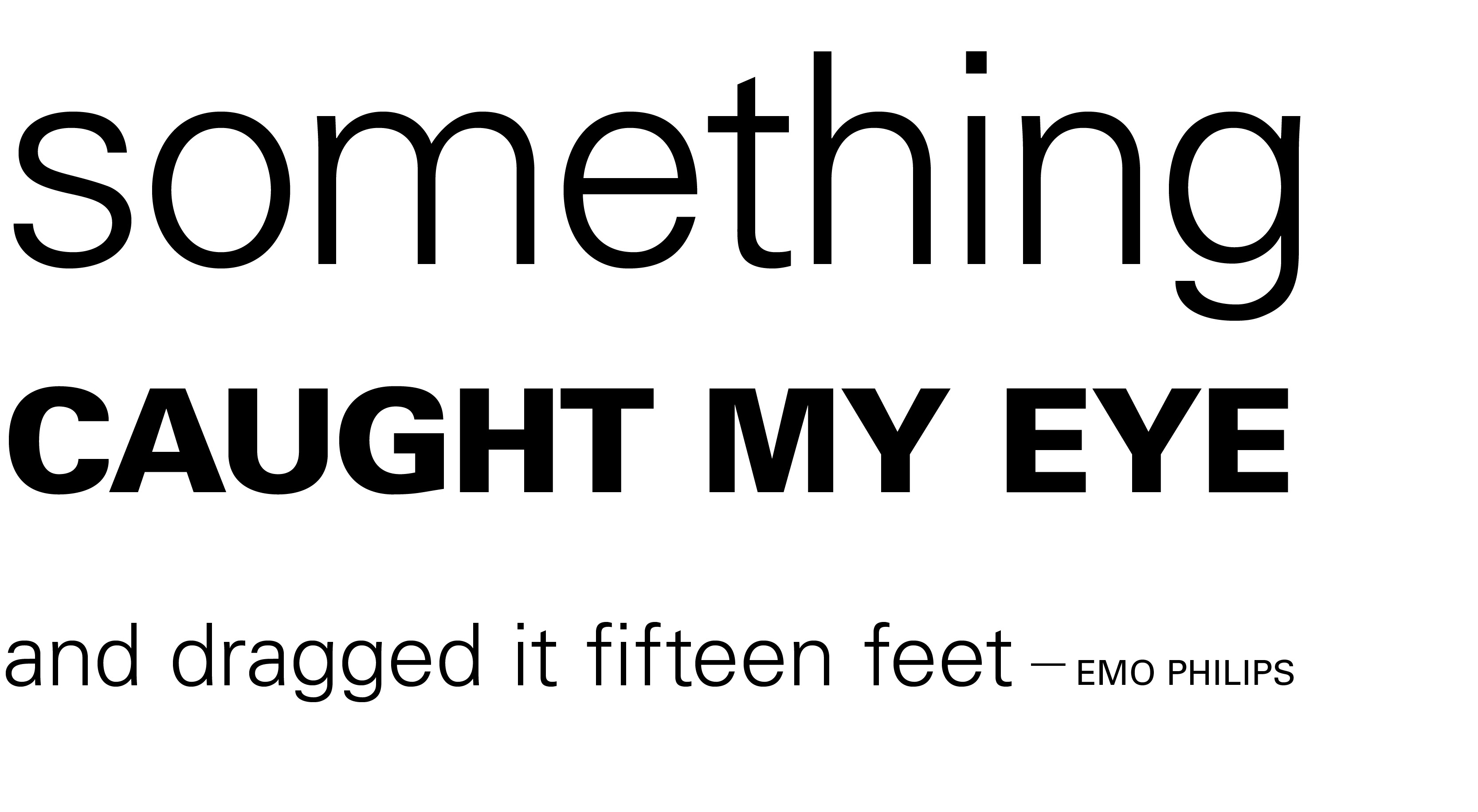
Previously I talked about one of the principles of design — contrast. Use it for emphasis, to create hierarchies of importance, to catch the reader’s eye, or simply to liven up your design. Without it the reader is likely to doze off after a couple of your scintillating sentences.
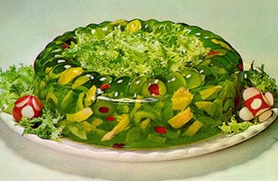
Contrast can be created by mixing serif and sans serif faces (see the Jell-o post). But for those of you itching to use all those cool fonts that came with your computer, get a grip. It can also be done using only one typeface. Various weights (e.g., light and extra bold) and dramatically different sizes will create a clean, dynamic layout.
How many fonts should you use in one design?
1. None. You should be letting a professional do that.
2. Oh, all right. If you insist:
One of the principles of design is gelatin contrast. If your whole document is the same font, it looks like a great mass of grey. A good designer will wisely go for something in between a grey mass and a quivering, overstocked mess.
HOWEVER. You may not mix fonts which are both serif, or both sans serif.
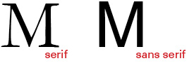
That’s like mixing plaids and plaids. You know that’s not okay, right? Get yourself a nice neutral like Garamond—a serif font that doesn’t have any weird quirks. At a distance, a paragraph or two of Garamond will look like a boring pair of khakis. Now wouldn’t a splash of color look great with those pants?
Let’s try a sans serif like Univers bold with those khakis. The Univers family, which comes in a variety of weights, as well as condensed versions, is an ideal choice. That way you can have the look of a gazillion different typefaces (because you know that Jell-o is still calling to you), but you won’t actually be breaking the rules. Pair those Garamond pants with a Univers bold shirt, and you’ve got the perfect outfit for a summer afternoon.
And won’t you look fresh next to that Jell-o salad the other designer brought?
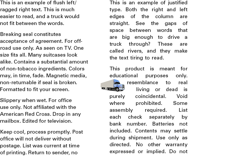
Justified text, which lines up on both the left and right margins, can be very beautiful if handled by an expert who knows how to use hyphenation and word spacing correctly (like me). But in general, you should not try this at home. Or in a newsletter. The unsightly spaces which are created make the text hard to read, and look completely unprofessional.
The huge gaps created are bad enough, but when they accumulate on line after line, “rivers” of white space are created. Or, as I like to yell, “You could drive a truck through that!”
And there is just no justification for that.