There’s a depressing topic for mid-February. But let’s leave thoughts of liposuction aside and concentrate on type.
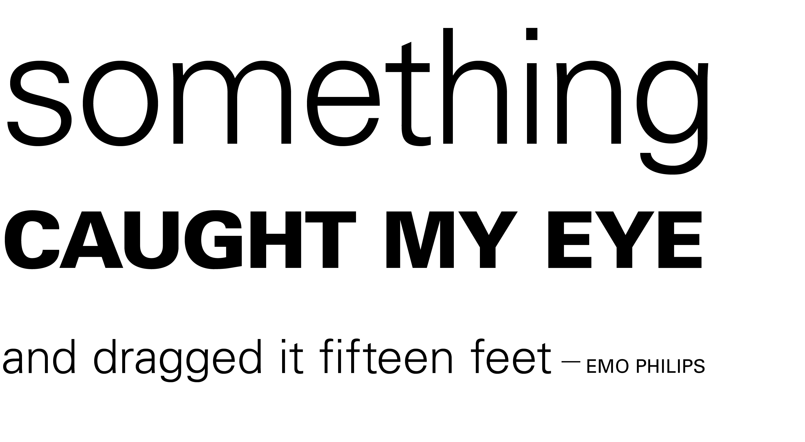
Previously I talked about one of the principles of design — contrast. Use it for emphasis, to create hierarchies of importance, to catch the reader’s eye, or simply to liven up your design. Without it the reader is likely to doze off after a couple of your scintillating sentences.
Contrast can be created by mixing serif and sans serif faces (see the Jell-o post). But for those of you itching to use all those cool fonts that came with your computer, get a grip. It can also be done using only one typeface. Various weights (e.g., light and extra bold) and dramatically different sizes will create a clean, dynamic layout.