How many fonts should you use in one design?
1. None. You should be letting a professional do that.
2. Oh, all right. If you insist:
- One is a bit boring.
- Two, if chosen correctly, can be ideal.
- Three—you’re pushing it, there.
- Four +: let me just give you a visual of what that looks like to a trained eye:
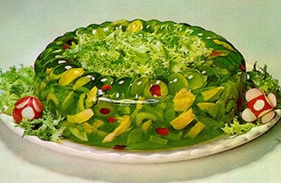
One of the principles of design is gelatin contrast. If your whole document is the same font, it looks like a great mass of grey. A good designer will wisely go for something in between a grey mass and a quivering, overstocked mess.
HOWEVER. You may not mix fonts which are both serif, or both sans serif.

That’s like mixing plaids and plaids. You know that’s not okay, right? Get yourself a nice neutral like Garamond—a serif font that doesn’t have any weird quirks. At a distance, a paragraph or two of Garamond will look like a boring pair of khakis. Now wouldn’t a splash of color look great with those pants?
Let’s try a sans serif like Univers bold with those khakis. The Univers family, which comes in a variety of weights, as well as condensed versions, is an ideal choice. That way you can have the look of a gazillion different typefaces (because you know that Jell-o is still calling to you), but you won’t actually be breaking the rules. Pair those Garamond pants with a Univers bold shirt, and you’ve got the perfect outfit for a summer afternoon.
And won’t you look fresh next to that Jell-o salad the other designer brought?
Using InDesign, the designer is working on setting up my novel (142,000 wds.) to be submitted to CreateSpace for a print-on-demand paperback and Kindle ebook. What is the best font to choose for the text? Garamond prints a bit light. She also has Minion as an option. Please advise the best font for readibility and a classic,professional “look.” Victoria Boynton, a writer friend, suggested I contact you. I enjoyed reading your blog–the info and the humor. Ginnah Howard
Hi Ginnah,
Here’s a short list of the most recommended body text fonts for books:
Bembo (not my favorite), Caslon, Baskerville, Sabon (I think this looks more modern), Janson (more classic)
Good luck!
Thank you for your quick response to my question about best fonts for text in a long novel.