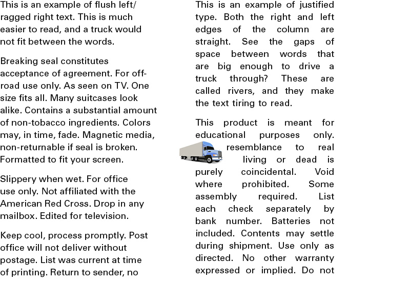
Justified text, which lines up on both the left and right margins, can be very beautiful if handled by an expert who knows how to use hyphenation and word spacing correctly (like me). But in general, you should not try this at home. Or in a newsletter. The unsightly spaces which are created make the text hard to read, and look completely unprofessional.
The huge gaps created are bad enough, but when they accumulate on line after line, “rivers” of white space are created. Or, as I like to yell, “You could drive a truck through that!”
And there is just no justification for that.