Author Archives: moviele

ammunition

Let’s talk about bullets.

A bullet is a symbol used to indicate unordered items in a list.

It could be a dot, a triangle, a solid square, or any of a number of other dingbats. On a Mac, the solid dot is created by pressing option 8.

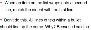
And yes, size matters:

bullets10

Alignment is important, too.

bullets9

In future posts, I’ll give you some more tips to make your printed pieces look like they were created by a professional.

frosting

Frosting is my favorite food group. I consider cake to be merely a vehicle to convey frosting to my mouth.

And what the hell does that have to do with typography, design, or this blog?

While I am probably one of the best print designers on the planet, (also, modest), learning web design has not exactly been a piece of cake. (See how I tied that in there?) When I tried to create my very first website, it was not pretty. Literally. At one point a picture of an American flag with camouflage behind it showed up in the page. Out of nowhere. Then I tried to design my own portfolio website (moviele.com). My poor, beleaguered, tech-savvy friend tried so hard to help me:

Him: Your friend has a cake (maybe that’s why he’s your friend). You like it, but want to add vanilla extract to the recipe.
What we did with Firefox is like taking a piece of the cake and trying to stuff vanilla extract into it. Doesn’t really work.
Instead, you need to get all the ingredients and add vanilla to that, then make the cake.
Then, when someone eats a piece, they get the new, improved, vanilla-yummy version.

Me: Does the cake have frosting?

fon·tid·i·ous

adjective
1. very critical about typography; hard to please
2. reflecting a meticulous, snarky, or demanding attitude toward typography and design
3. easily disgusted by Comic Sans

Germanic, from font + fastidious, as defined by Schantz. First known use: last Saturday, at breakfast.


I’m a snob about typography, and I’m not afraid to say so. Which can be pretty annoying when you’re sitting across from me at breakfast wearing a t-shirt you designed. It’s a funny t-shirt, too, but you used italics. “Italics are only for book titles, and emphasis, and foreign words!” I start yelling at you, waving my peanut butter toast. “It is important not to overdo the use of italics to emphasize words. After a while, it loses its effect and the language starts to sound like something out of a comic book.” You’ve begun to back your chair away.

And karma comes nipping at my ass two days later when the New York Times unveils its new web design and the left column has all the headlines in italics.

I must pluck my eyes from my head.