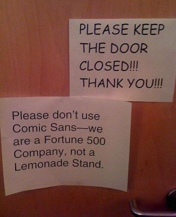
You want to look like a professional, don’t you? Font choices are overwhelming, and so is the amount I could write about this. So for today, three tips to keep you from looking like a boob an amateur.
Don’t choose a typeface because it’s the newest thing out there.
“New” fonts aren’t always the best choice for printed materials that you hope will be around for a while. Remember, someone once thought avocado green appliances were a good idea.
Don’t choose a typeface because it has the perfect name.
Let’s say, for example, that your name is Charles S. Harrington. You want to start promoting your business, and you discover that there’s a font called Harrington. Perfect! But wait! There’s also one called Charles S. So you try them both out:
If you’re the master of ceremonies at a circus, the first might be ok on your business card. And if you’re a chimney sweep, the second might work. Fonts have personalities, for lack of a better word. The first font, Harrington, is whimsical and old fashioned (and, let’s face it, pretty awful). It’s not serious, or weighty, or modern. The second font, Charles S., is what’s referred to as a grunge font. It looks like it was scratched and smeared. Think about what you want to portray with your type. If you’re a litigator trying to attract new clients, I don’t imagine you’d want them to see you as frivolous and silly. On the other hand, if you’re an up-and-coming interior designer, smeared and sooty should not be your first choice.

