too many fonts spoil the Jell-o

How many fonts should you use in one design?

1. None. You should be letting a professional do that.

2. Oh, all right. If you insist:

  • One is a bit boring.
  • Two, if chosen correctly, can be ideal.
  • Three—you’re pushing it, there.
  • Four +: let me just give you a visual of what that looks like to a trained eye:

dessert

One of the principles of design is gelatin contrast. If your whole document is the same font, it looks like a great mass of grey. A good designer will wisely go for something in between a grey mass and a quivering, overstocked mess.

HOWEVER. You may not mix fonts which are both serif, or both sans serif.

serif vs.sans

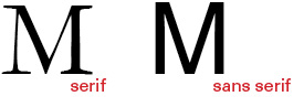
That’s like mixing plaids and plaids. You know that’s not okay, right? Get yourself a nice neutral like Garamond—a serif font that doesn’t have any weird quirks. At a distance, a paragraph or two of Garamond will look like a boring pair of khakis. Now wouldn’t a splash of color look great with those pants?

Let’s try a sans serif like Univers bold with those khakis. The Univers family, which comes in a variety of weights, as well as condensed versions, is an ideal choice. That way you can have the look of a gazillion different typefaces (because you know that Jell-o is still calling to you), but you won’t actually be breaking the rules. Pair those Garamond pants with a Univers bold shirt, and you’ve got the perfect outfit for a summer afternoon.

And won’t you look fresh next to that Jell-o salad the other designer brought?

you could drive a truck through that

Justified text, which lines up on both the left and right margins, can be very beautiful if handled by an expert who knows how to use hyphenation and word spacing correctly (like me). But in general, you should not try this at home. Or in a newsletter. The unsightly spaces which are created make the text hard to read, and look completely unprofessional.

The huge gaps created are bad enough, but when they accumulate on line after line, “rivers” of white space are created. Or, as I like to yell, “You could drive a truck through that!”

And there is just no justification for that.

justification


your password has expired

Oh, for the days when you could use “Bosco” as your password. I recently looked online for information about how to create a password I could remember. Here is a brief synopsis of what I found:

Please create a password.

brusselssprouts

Sorry, but your password must contain an uppercase letter, a lowercase letter, a number, a hideous personal secret, three distinctly different recipes for lemon basil chicken, the original battle plans for the invasion of Normandy, one of your kidneys, at least four elements from the periodic table, and a plot containing a protagonist with some character development and a twist ending.

Due to the severity of these restrictions, your password must be changed every day.

unhappy endings, part 2: widows and orphans

“My Dearest Beloved, I am writing you this letter with the believe you will treat my message with utmost honesty and sincerity…”

No, no, no. I’m talking about widows and orphans in typography, not internet scams. Duh.

A widow is the last word or line of a paragraph that appears at the beginning of the next column or page.

An orphan is a word or part of a word that appears by itself at the end of a paragraph.

widows and orphans3
Half of the websites written about good typography will tell you the exact opposite, so I went to the boss — The Chicago Manual of Style.

Widows and orphans interrupt the reader’s flow, waste space, and make you look like an amateur.

And never, ever, leave a subhead at the bottom of a column. Never. Ever.

Depending on what software you’re using, you can find lots of info online about how to fix these horrors. If you work with a meticulous editor, as I do, you won’t have a choice about whether or not to fix them. You’ll learn to mess about with hyphenation, letterspacing, wordspacing, and soft returns to avoid unhappy endings. And clients.

use your inside voice

DON’T WRITE IN ALL CAPS.

Why? Well, yes, in email it looks like you’re shouting.

But designwise, the ascenders and descenders (the parts of letters that stick up above or down below the baseline—b, k, y, g, for example) help us read words by shape. With all caps, we have to identify nearly every letter.


u&lc

history, rewritten

Someone (who shall remain nameless) is about to comment that in my six-word memoir (yesterday’s post), ex husband should have been hyphenated, and what I actually wrote was a five- and one-hyphenated-word memoir.

and to this person I say

you really should get a life

so I will rewrite my history:

still searching for my future ex-husband

six words

If you haven’t seen this yet, check out the Six-Word Memoir®, a project of SMITH Magazine.

Some of my favorites:

my life’s written in comic sans

online dating: hell I pay for

my life made my therapist laugh


This is mine:

still searching for future ex husband


I couldn’t make this stuff up.

font choice don’ts

You want to look like a professional, don’t you? Font choices are overwhelming, and so is the amount I could write about this. So for today, three tips to keep you from looking like a boob an amateur.

Don’t choose a typeface because it’s the newest thing out there.

“New” fonts aren’t always the best choice for printed materials that you hope will be around for a while. Remember, someone once thought avocado green appliances were a good idea.

Don’t choose a typeface because it has the perfect name.

Let’s say, for example, that your name is Charles S. Harrington. You want to start promoting your business, and you discover that there’s a font called Harrington. Perfect! But wait! There’s also one called Charles S. So you try them both out:harrington copy

If you’re the master of ceremonies at a circus, the first might be ok on your business card. And if you’re a chimney sweep, the second might work. Fonts have personalities, for lack of a better word. The first font, Harrington, is whimsical and old fashioned (and, let’s face it, pretty awful). It’s not serious, or weighty, or modern. The second font, Charles S., is what’s referred to as a grunge font. It looks like it was scratched and smeared. Think about what you want to portray with your type. If you’re a litigator trying to attract new clients, I don’t imagine you’d want them to see you as frivolous and silly. On the other hand, if you’re an up-and-coming interior designer, smeared and sooty should not be your first choice.

Don’t choose a typeface just because it came with your computer.

comic sans

unhappy endings part 1, bitch

Even though I’m a complete snob when it comes to spelling and the proper use of typography, sometimes I get a little fuzzy on the finer points of grammar. My person, who is an English professor, received this birthday card:

First girl: “Where’s your birthday party at?”

Second girl: “Don’t end a sentence with a preposition.”

First girl: “Where’s your birthday party at, bitch?”

I find this to be a handy solution when unsure about proper sentence structure.
Bitch.

you had me at the en dash

I’ve met precisely two people who know what an en dash is for. One is my very favorite client of all time, who calls me her “precious jewel,” and the other was the first guy I ever met on a dating site. He turned out not to be such a gem. But he did have a British accent.

If you want to look like you really know what you’re doing when designing with type (to at least three people), here’s what you need to know about the en dash.

An en dash is used to replace the word “to” in ranges of years or time.

1–10 pm
1981 – 2011

It’s called an en dash because the dash is the width of a lowercase letter n.

Whether or not to put spaces before and after the dash is up for debate.

A designer who does not care about my opinion, or that of the dating-site guy or my client, will use a hyphen instead.

1-10 pm
1981-2011

It’s more obvious in some typefaces than others, but,

–  this is a hyphen (it’s for—yes—hyphenation)

– this is an en dash (and from now on you will use it proudly)

— this is an em dash (use this one to add a thought—sparingly—in informal writing)